
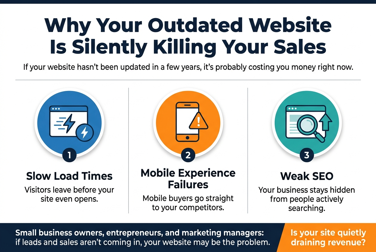
Why Your Outdated Website Is Silently Killing Your Sales
If your website hasn’t been updated in a few years, it’s probably costing you money right now — and you might not even realize it.
This is for small business owners, entrepreneurs, and marketing managers who feel like their site looks “fine” but can’t figure out why leads and sales aren’t coming in. Spoiler: your website is likely the problem.
In this post, we’ll break down three of the biggest ways an outdated website hurts your bottom line — slow load times that send visitors running, mobile experience failures that push buyers straight to your competitors, and weak SEO that keeps your business hidden from people actively searching for what you sell. We’ll also show you exactly how to tell if your site is quietly draining your revenue.
The Hidden Cost of an Outdated Website

Slow Load Times Are Driving Away Your Customers
The Direct Link Between Page Speed and Conversion Rates
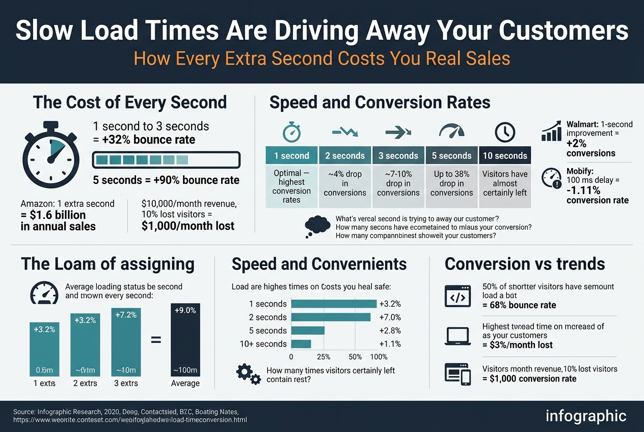
Page speed and conversion rates are tied together more tightly than most people realize. Walmart found that for every 1-second improvement in load time, they saw a 2% increase in conversions. Mobify discovered that a 100-millisecond delay in load time knocked their conversion rate down by 1.11%. These are tiny fractions of time producing massive financial consequences.
Here’s a side-by-side look at what the data tells us:
| Load Time | Impact on Conversions |
|---|---|
| 1 second | Optimal — highest conversion rates |
| 2 seconds | ~4% drop in conversions |
| 3 seconds | ~7-10% drop in conversions |
| 5 seconds | Up to 38% drop in conversions |
| 10 seconds | Visitors have almost certainly left |
Why does this happen? It comes down to trust and patience. When someone lands on your site and it takes more than a couple of seconds to load, their brain immediately starts questioning things:
- Is this site even legitimate?
- Is something broken?
- Should I just go somewhere else?
Most of the time, they go somewhere else. You had their attention for a brief window — maybe 3 seconds — and a slow website burned that window before your value proposition even had a chance to land.
Speed also affects behavior beyond just the initial visit. Slow sites get lower add-to-cart rates, fewer form completions, reduced email sign-ups, and weaker overall engagement. When the experience feels sluggish, people do less. They browse less, click less, and buy less. A fast site creates momentum. A slow site creates friction — and friction kills sales.
Simple Signs Your Website Speed Is Hurting Your Business
You don’t need to be a developer to spot the warning signs. Here are the clearest signals that your website speed is actively costing you customers:
You can feel the slowness yourself
Load your website on your phone using your mobile data connection — not Wi-Fi. If you’re tapping your fingers waiting for it to load, your customers are doing the same thing. This is the quickest gut-check you can do.
Your bounce rate is high
Log into Google Analytics and check your bounce rate. If more than 60-70% of visitors are leaving after viewing just one page, slow load times could be a major factor. A healthy bounce rate for most business websites sits around 40-55%.
Your Google PageSpeed score is below 50
Run your website through Google PageSpeed Insights (it’s free). Google scores pages from 0-100. Anything below 50 is considered poor, and anything between 50-89 needs improvement. A score in this range is a direct signal that your site is underperforming.
You’re getting traffic but not sales
If your analytics show decent visitor numbers but weak sales or lead generation, speed is one of the first things to investigate. Traffic without conversions often points to an experience problem, not a marketing problem.
Your site is more than 3-4 years old
Older websites were built for older technology, older browsers, and older internet speeds. If your site hasn’t had a performance audit in the last few years, there’s a very good chance it’s running slower than it should be.
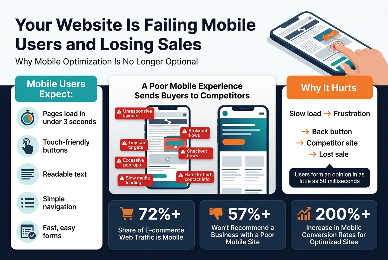
Your Website Is Failing Mobile Users and Losing Sales
Outdated SEO Is Making You Invisible to Buyers
How Old Website Structures Kill Your Search Rankings
Search engines have come a long way from simply matching keywords on a page. Google now looks at hundreds of signals when deciding where to rank your site, and the underlying structure of your website plays a massive role in that process.
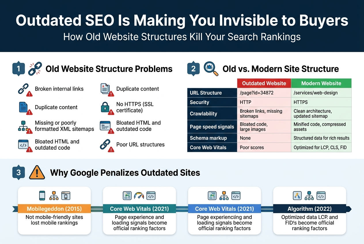
Old websites were often built without any thought for how search engines crawl and read content. Common structural problems that tank rankings include:
- Broken internal links that prevent search bots from moving through your pages
- Duplicate content caused by outdated CMS platforms generating multiple URLs for the same page
- Missing or poorly formatted XML sitemaps that leave Google guessing about what pages exist
- No HTTPS (SSL certificate) — Google has flagged non-secure sites as a ranking disadvantage since 2014
- Bloated HTML and outdated code that makes it harder for crawlers to identify what your page is actually about
- Poor URL structures full of random numbers and symbols rather than clean, descriptive slugs
When a crawler hits your site and runs into these issues repeatedly, it starts treating your domain as low quality. That drags every page on your site down, not just the broken ones.
Here’s a quick look at how old vs. modern site structures compare from a search engine’s perspective:
| Factor | Outdated Website | Modern Website |
|---|---|---|
| URL Structure | /page?id=34872 | /services/web-design |
| Security | HTTP | HTTPS |
| Crawlability | Broken links, missing sitemaps | Clean architecture, updated sitemap |
| Page speed signals | Bloated code, large images | Minified code, compressed assets |
| Schema markup | None | Structured data for rich results |
| Core Web Vitals | Poor scores | Optimized for LCP, CLS, FID |
The Customers You Are Missing Because They Cannot Find You
Think about how you find anything today. You search for it. Your customers do the same thing — whether they’re looking for a plumber, a software tool, a restaurant, or a business consultant.
The data on search behavior is hard to ignore:
- 68% of all online experiences begin with a search engine (BrightEdge)
- The first result on Google gets roughly 27–30% of all clicks
- Results on page two get less than 1% of total clicks
- 75% of users never scroll past the first page
So if your website has slipped to page two or beyond for your most important keywords, you’re essentially invisible. The customer didn’t decide not to choose you — they never even saw you as an option.
Here’s what that invisibility costs in real terms:
- A competitor with a better-optimized site is capturing leads you should be getting
- People searching for exactly what you sell are landing on someone else’s product page
- You’re spending money on paid advertising to compensate for organic traffic you’ve lost, rather than earning it back through a site that actually performs
- Your brand doesn’t show up in searches that include your city, your service type, or your industry terms
The customers you’re missing aren’t abandoning you. They simply can’t find you. They’ve already found someone else who had a website Google trusted enough to show them.
How Fresh Content and Modern SEO Drive More Traffic
Getting your SEO back on track isn’t just about fixing technical problems on the back end. A big part of it is showing Google — and your potential customers — that your site is alive, relevant, and worth paying attention to.
Fresh content sends the right signals
Google’s crawlers revisit websites regularly. When they find new, updated content each time they visit, they categorize your site as active and increase how frequently they come back. Sites that never update get crawled less often, which means new pages take longer to get indexed and older pages stay stale in the rankings.
Creating consistent content doesn’t mean writing blog posts just to have them. The goal is content that genuinely answers questions your buyers are already asking. This could be:
- Blog posts that address common problems your customers face
- Updated service pages that reflect what you currently offer
- Case studies or project showcases that demonstrate real results
- FAQ sections that align with voice search and conversational queries
- Location-specific landing pages if your business serves multiple areas
Modern SEO goes beyond keywords
An updated SEO strategy looks at the full picture:
- Search intent alignment — making sure your content matches what the person searching actually wants, not just what the keyword says on the surface
- E-E-A-T (Experience, Expertise, Authoritativeness, Trustworthiness) — Google’s framework for evaluating content quality; your site needs to signal credibility through author bios, testimonials, case studies, and accurate information
- Internal linking structure — building a logical flow between related pages so both users and crawlers can move through your site naturally
- Core Web Vitals optimization — ensuring your pages load fast, stay visually stable, and respond quickly to user interaction
- Structured data (schema markup) — helping Google understand exactly what your content is about and making you eligible for rich results like star ratings, FAQs, and product highlights in the search results
Here’s a side-by-side look at how outdated vs. modern SEO approaches stack up:
| SEO Element | Outdated Approach | Modern Approach |
|---|---|---|
| Keyword use | Stuffing keywords into every paragraph | Natural usage aligned with search intent |
| Content frequency | Static pages, rarely updated | Regular publishing schedule with fresh content |
| Link building | Buying links, mass directories | Earning links through quality content and outreach |
| Technical health | Ignored or unknown | Regular audits, Core Web Vitals monitoring |
| User signals | Not considered | Bounce rate, dwell time, and CTR factored in |
| Local SEO | Basic NAP listing | Google Business Profile, local schema, geo-targeted content |
The businesses ranking at the top of search results right now aren’t just lucky. They’ve put in the work to give Google what it wants — well-structured pages, credible content, fast load times, and a steady stream of fresh information that proves their site is worth sending people to.
Weak Calls to Action Are Killing Your Conversions
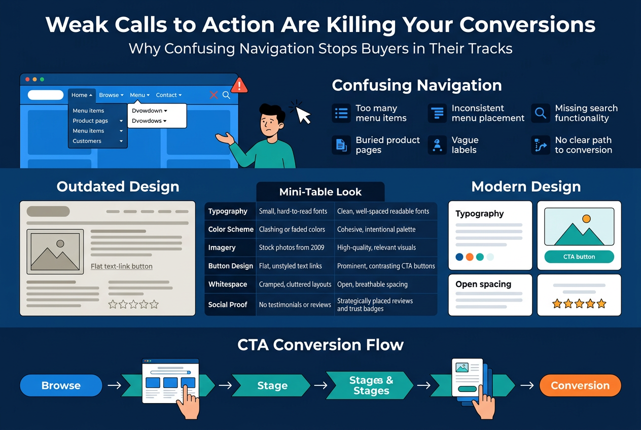
How Outdated Design Makes Your Offers Less Compelling
Design is never just about looks. It directly shapes whether someone trusts you, believes in your value, and feels confident enough to hand over their money or their contact details.
An outdated website design sends signals — whether you intend it to or not. Visitors subconsciously evaluate your credibility based on how your site looks and feels. If the design looks like it was built a decade ago, many people will assume the business behind it hasn’t kept up either. That’s a trust problem, and trust problems kill conversions.
Here’s a side-by-side look at how outdated vs. modern design elements affect buyer perception:
| Design Element | Outdated Version | Modern Version | Impact on Conversions |
|---|---|---|---|
| Typography | Small, hard-to-read fonts | Clean, well-spaced readable fonts | Easier reading = longer time on site |
| Color Scheme | Clashing or faded colors | Cohesive, intentional palette | Builds brand trust and visual clarity |
| Imagery | Stock photos from 2009 | High-quality, relevant visuals | Increases emotional connection |
| Button Design | Flat, unstyled text links | Prominent, contrasting CTA buttons | Drives more clicks |
| Whitespace | Cramped, cluttered layouts | Open, breathable spacing | Reduces cognitive load |
| Social Proof | No testimonials or reviews | Strategically placed reviews and trust badges | Increases purchase confidence |
Beyond the visual comparison, outdated design often fails at a structural level too. Offers that could be compelling get buried in walls of text. Pricing pages look cluttered instead of clear. Value propositions sit in places where nobody reads them. The design itself undercuts the quality of what you’re actually selling.
When someone hits a sleek, well-organized competitor site right after yours, the contrast is immediate. You lose the sale not because your product is worse — but because your website made it look that way.
The Power of Clear and Modern Calls to Action
A call to action is the moment where browsing turns into buying. It’s the bridge between someone being interested and someone actually doing something. And yet, so many businesses treat their CTAs as an afterthought, slapping a generic “Click Here” or “Submit” button at the bottom of the page and hoping for the best.
Clear, modern CTAs do several things at once:
- They remove ambiguity. The visitor knows exactly what happens when they click.
- They create urgency without being pushy. Phrases like “Get Your Free Quote Today” or “Start Saving Now” move people to act without feeling manipulative.
- They match the visitor’s intent. A CTA placed after a testimonial section feels different from one placed after a product description — and both should be written accordingly.
- They stand out visually. A button that blends into the background is a button nobody clicks.
Here are examples of weak CTAs vs. strong ones:
| Weak CTA | Strong CTA | Why It Works Better |
|---|---|---|
| “Submit” | “Send My Free Consultation Request” | Tells the user exactly what they’re getting |
| “Learn More” | “See How We Cut Costs by 40%” | Leads with a specific, tangible benefit |
| “Buy Now” | “Get Yours Before Stock Runs Out” | Adds urgency that motivates action |
| “Contact Us” | “Talk to a Real Expert Today” | Makes the experience feel personal and immediate |
| “Sign Up” | “Join 10,000 Customers Who Save Every Month” | Uses social proof directly in the action |
How to Identify If Your Website Is Costing You Sales
Key Warning Signs Your Website Needs an Urgent Upgrade
Some website problems are loud and obvious. Others quietly bleed your revenue dry while you’re busy doing everything else. Here are the red flags that should make you stop and pay attention:
- Your bounce rate is above 70% — People are landing on your site and leaving almost immediately. That’s not just a vanity metric problem; it means your site isn’t giving visitors a reason to stick around.
- Your website looks exactly the same as it did five years ago — Design trends evolve, and so do user expectations. A site that looked sharp in 2019 can feel ancient and untrustworthy today.
- You’re getting traffic but no leads or sales — If people are visiting but not converting, something on the site is breaking the connection between interest and action.
- Your site takes longer than 3 seconds to load — Most visitors won’t wait. They’ll close the tab and head straight to a competitor.
- Your contact form, checkout, or any interactive element is broken — Broken functionality is one of the fastest ways to lose a sale permanently.
- You’re not showing up on the first page of Google for your main keywords — If your competitors are ranking and you’re not, your site’s technical and content structure is likely outdated.
- Customers have mentioned your website feels confusing or hard to navigate — When real people tell you this, believe them immediately.
- Your site isn’t mobile-friendly — Pull it up on your phone right now. If you have to pinch and zoom to read anything, you have a serious problem.
- You’re embarrassed to share your website URL — Trust that gut feeling. It exists for a reason.
Any one of these warning signs is worth addressing. Multiple ones together? That’s a website that’s actively working against your business goals.
Tools to Measure How Your Website Is Performing Right Now
You don’t need to guess at your website’s performance. There are free and paid tools that give you hard data, and most of them take less than five minutes to run.
Speed and Core Web Vitals
| Tool | What It Measures | Cost |
|---|---|---|
| Google PageSpeed Insights | Load speed, Core Web Vitals, mobile performance | Free |
| GTmetrix | Detailed page speed breakdown, waterfall charts | Free / Paid |
| WebPageTest | Advanced load time testing across different devices and locations | Free |
| Pingdom | Speed monitoring with historical tracking | Paid |